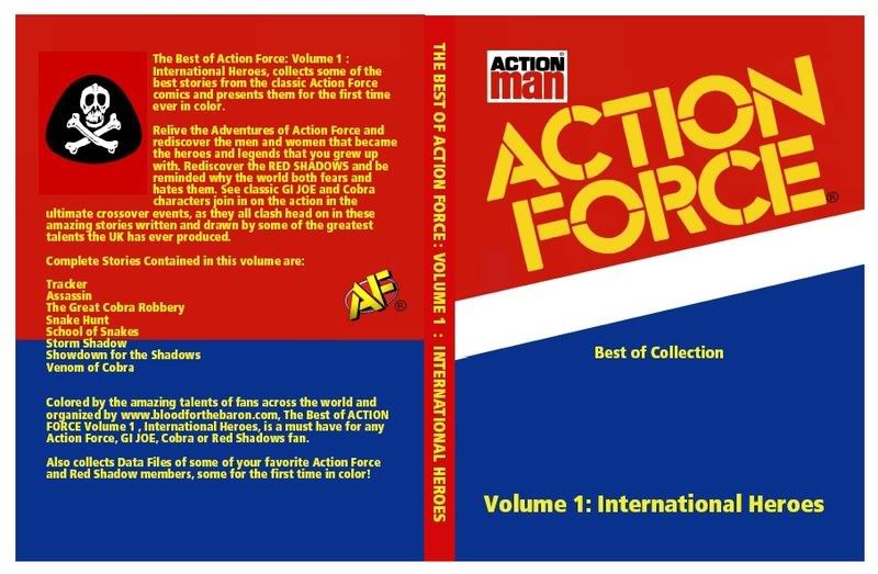
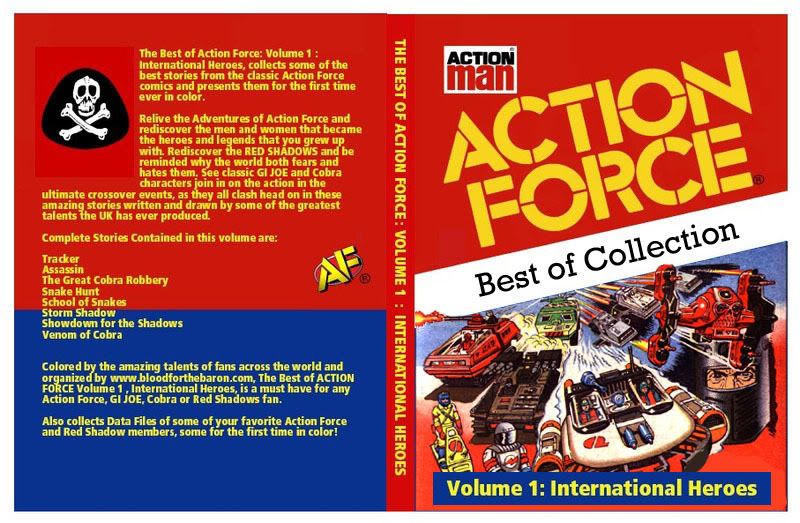
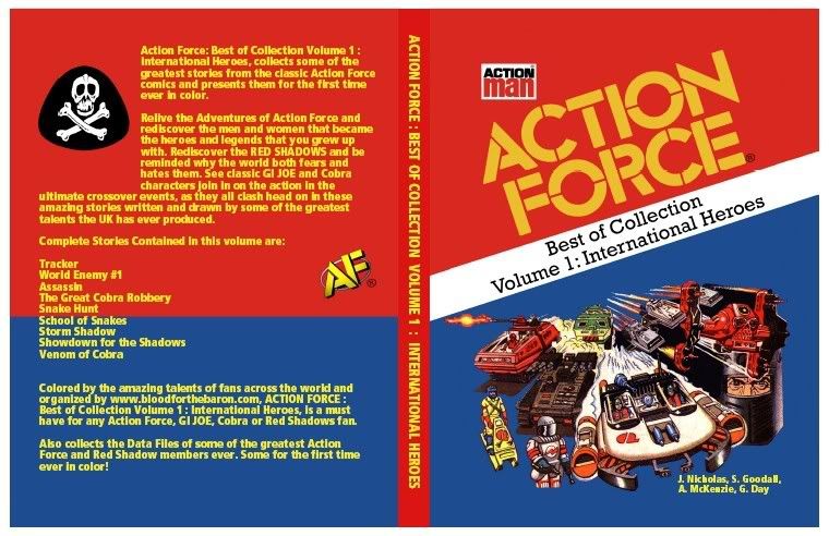
this was tough for me as the cover without the pic resembles the packaging more but I cant deny that with the pic on the cover is looks Awesome too! I lean towards the pic but what does everyone else think? Please vote and let me know
Well I'd say with a picture but not as is, there's a lot more could be done, specifically make the logo smaller so as to be in proportions to one of the filecards and then make the picture background blue. I'd also make the back cover one colour (or hey - a take on a filecard back?) and I think it'd be a good idea to put a little "not for resale" somewhere in small print.
I would love to get a blue background on the picture that would seal the deal with me for sure as that would solve the little thing that I like about the first one , with the blue it looks JUST like the packaging! I wonder if you or meertoh could do that??