

advert for colouring project
Re: advert for colouring project
...and for bonus geek points,  came with a green backpack.
-
Red Laser

- don't eat yellow snow

- Posts: 8083
- Joined: 19 Jun 2007 22:56
- Location: Sittin' on the dock of a bay
Re: advert for colouring project
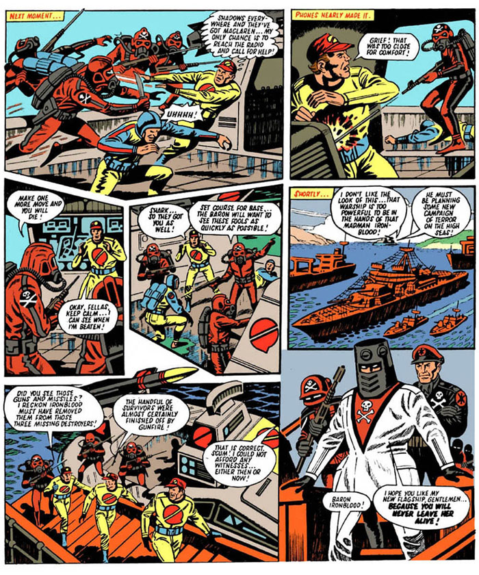
I was going for a desert stronghold type of dungeon look and was going for the toy range colour scheme on the logo. Thanks for the compliments I really was nervous about trying this out but wanted to for awhile now. If you think my work is good enough Jamar to do a story then great I would love to help out.The Baron wrote:If you're feeling bold, try selecting the layer beneath 'colour', set your brush to 'lighten' and you'll be able to change the colour of the original black line. That may sort the logo probelm.
I did it with the "Next week..." text and dialogue boxes on Sea Fury:
If I was to be really nitpicky, I'd do the floor as grey, to make it feel cold in his dungeon. The flesh is better, but a little too yellow. Try using 'FDAB5F'
Sorry if I sound critical, I'm just keen!
Want blood puddle!!
Spock, where the hell's the power you promised?
One damn minute, Admiral
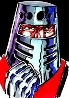
"Red! The colour of my Shadows, The colour of fire and of blood......All that I stand for!" Baron Ironblood, Operation Bloodhound
One damn minute, Admiral
"Red! The colour of my Shadows, The colour of fire and of blood......All that I stand for!" Baron Ironblood, Operation Bloodhound
Re: advert for colouring project
Yeah but the trouble is the logo part that should be bright red is grey to begin with. The technique I suggest means you can change the grey to red, rather than putting red on top of grey.
[blood puddle]
[blood puddle]
-
Red Laser
- don't eat yellow snow
- Posts: 8083
- Joined: 19 Jun 2007 22:56
- Location: Sittin' on the dock of a bay
Re: advert for colouring project
Ok I did another ad see what you think 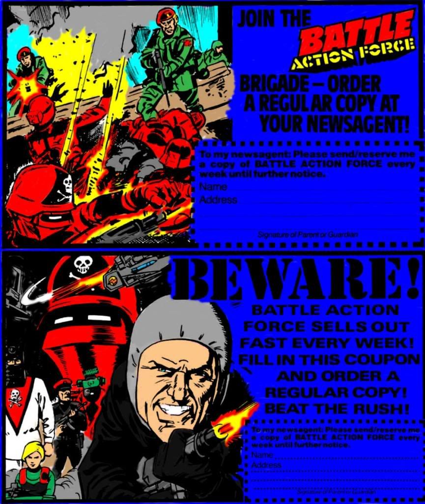
Spock, where the hell's the power you promised?
One damn minute, Admiral
"Red! The colour of my Shadows, The colour of fire and of blood......All that I stand for!" Baron Ironblood, Operation Bloodhound
One damn minute, Admiral
"Red! The colour of my Shadows, The colour of fire and of blood......All that I stand for!" Baron Ironblood, Operation Bloodhound
Re: advert for colouring project
Not bad, I prefer the other one though.
Couple of points, you've done the dead Shadows legs grey. I see they kind of look like billowy smoke, but you can see the top of his boot at the end of the right leg. Just below that, I would give the Shadow a black glove to break up the red a bit. You also missed a bit of brown above the left leg.
Not sure if you're going for the "sketchy" look, but there's quite a few bits where colours bleed over the lines and spots of white as well. That can work, but certain bits are key, such as the white in Buckingham's eyes and teeth. If you're having trouble, I suggest magnifying the area up to 400% (use CTRL+ and CTRL-), it becomes a doddle.
I also thoroughly recommend getting a USB mouse and tablet if you're planning on doing a lot of colouring - I love it.
But hey, two pages in one day with your first use of Photoshop is bloody good going! No offence to the other colourists, but it's also nice to see when someone actually knows the proper colour schemes.

Re: advert for colouring project
Really good stuff. It's great to find out how those black and white images get colourised, the things to be considered that would never occur to me.
This thread is like a mini tutorial in its own right.
This thread is like a mini tutorial in its own right.
-
Red Laser
- don't eat yellow snow
- Posts: 8083
- Joined: 19 Jun 2007 22:56
- Location: Sittin' on the dock of a bay
Re: advert for colouring project
Alteration made 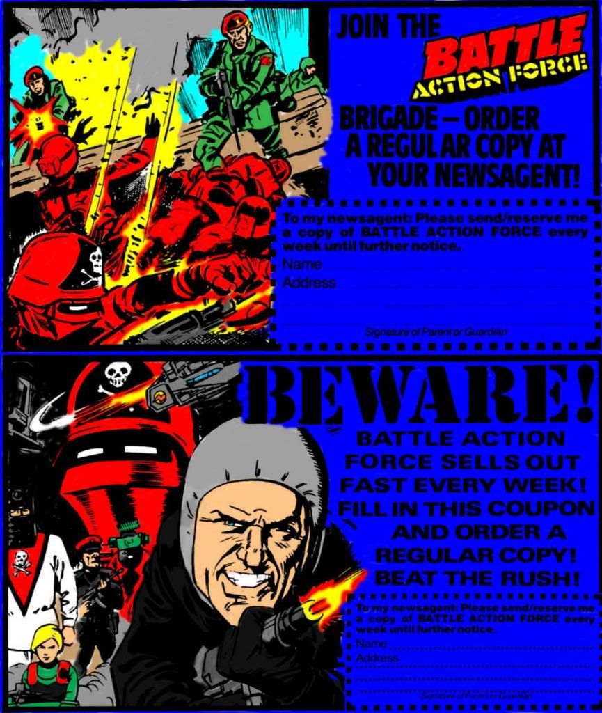
Spock, where the hell's the power you promised?
One damn minute, Admiral
"Red! The colour of my Shadows, The colour of fire and of blood......All that I stand for!" Baron Ironblood, Operation Bloodhound
One damn minute, Admiral
"Red! The colour of my Shadows, The colour of fire and of blood......All that I stand for!" Baron Ironblood, Operation Bloodhound
-
Chopper
- This is what you get when you mess with the SAS

- Posts: 7221
- Joined: 09 Apr 2003 08:30
- Location: Melbourne
Re: advert for colouring project
Looking good mate. only one tensy tiny little thing tho. that blue background detracts from the main images a little. BAF were notorious for using washed out colours so it might look better being the same colour as the sky in the first image? If this is your first work, you are doing a great job so far. Keep it up. The colouring too 
-
Red Laser
- don't eat yellow snow
- Posts: 8083
- Joined: 19 Jun 2007 22:56
- Location: Sittin' on the dock of a bay
Re: advert for colouring project
Cheers Mark all compliments are appreciated and yes this is the first time I have ever attempted doing this it's good fun but also hard work. I totally appreciate the work that goes into re-colouring the pages having done it myself now.
Spock, where the hell's the power you promised?
One damn minute, Admiral
"Red! The colour of my Shadows, The colour of fire and of blood......All that I stand for!" Baron Ironblood, Operation Bloodhound
One damn minute, Admiral
"Red! The colour of my Shadows, The colour of fire and of blood......All that I stand for!" Baron Ironblood, Operation Bloodhound
-
Chopper
- This is what you get when you mess with the SAS
- Posts: 7221
- Joined: 09 Apr 2003 08:30
- Location: Melbourne
Re: advert for colouring project
I'm going cross-eyed doing Major Bludd as we speak. I'm too knackered to even bother retyping that. 