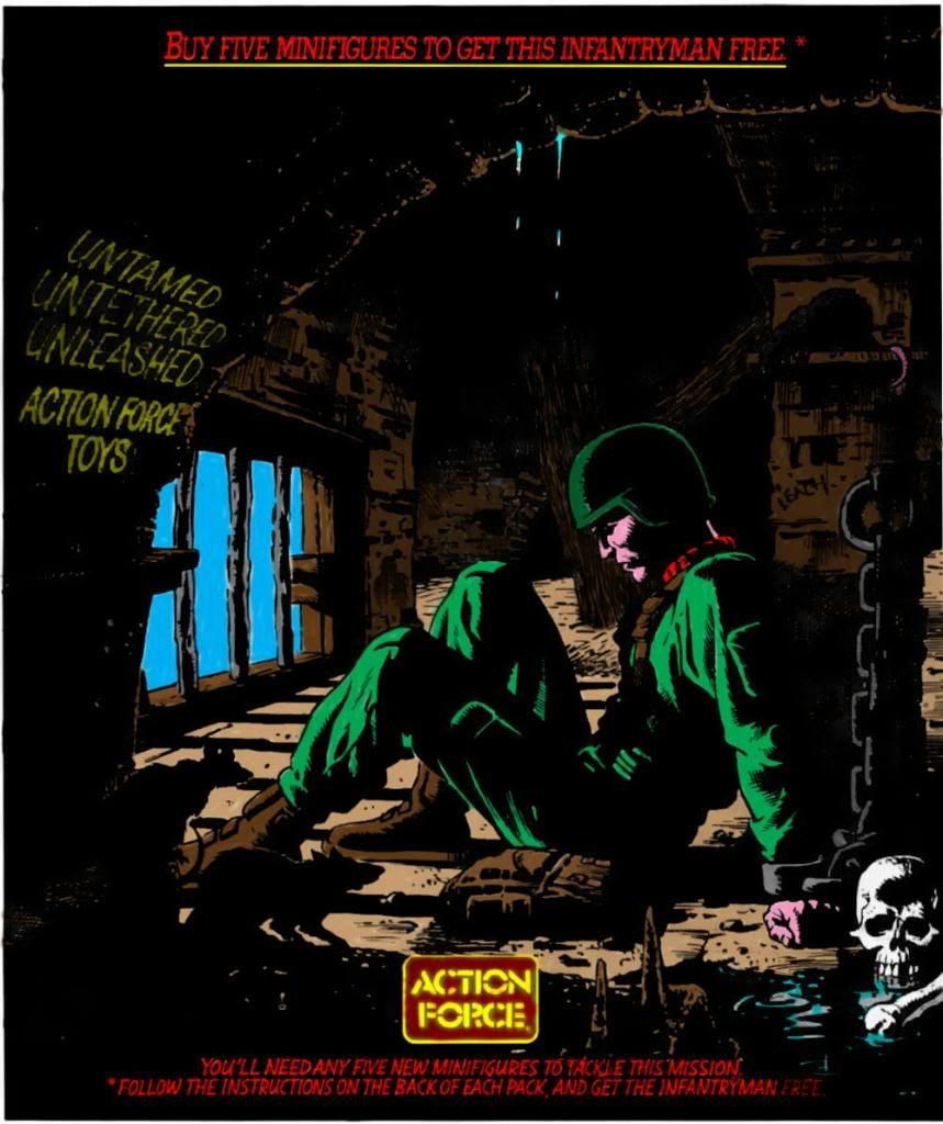
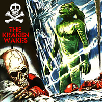
 I have re-coloured this on photoshop please give constructive comments it's my first ever Photoshopped pic which I would like considered for the colouring project.
advert for colouring project
-
Red Laser

- don't eat yellow snow

- Posts: 8083
- Joined: 19 Jun 2007 22:56
- Location: Sittin' on the dock of a bay
advert for colouring project
I have re-coloured this on photoshop please give constructive comments it's my first ever Photoshopped pic which I would like considered for the colouring project.Spock, where the hell's the power you promised?
One damn minute, Admiral
"Red! The colour of my Shadows, The colour of fire and of blood......All that I stand for!" Baron Ironblood, Operation Bloodhound
One damn minute, Admiral
"Red! The colour of my Shadows, The colour of fire and of blood......All that I stand for!" Baron Ironblood, Operation Bloodhound

Re: advert for colouring project
all i'd say is the flesh tone is a bit too pink!
"Beer is living proof that God loves us and wants us to be happy"
-
Red Laser
- don't eat yellow snow
- Posts: 8083
- Joined: 19 Jun 2007 22:56
- Location: Sittin' on the dock of a bay
Re: advert for colouring project
I wasn't sure what skin tone to use Ross any suggestions on that? There seemed to be only magenta not pink to use.
Spock, where the hell's the power you promised?
One damn minute, Admiral
"Red! The colour of my Shadows, The colour of fire and of blood......All that I stand for!" Baron Ironblood, Operation Bloodhound
One damn minute, Admiral
"Red! The colour of my Shadows, The colour of fire and of blood......All that I stand for!" Baron Ironblood, Operation Bloodhound

Re: advert for colouring project
Very nice! I get what you mean about the flesh colour now, it looks just a little bit too purple.
But that's a fantastic first piece! Nice one!
I hope you don't mind me giving you a critique... the little segment underneath his knee should be floor coloured, not green. You can see the edge is actually the extension of one of the bar shadows.
I'd also be tempted to make the blue sky a lot darker, almost night and also make his uniform darker, like the green of his helmet. It's such a moody, oppressive piece I think it needs to be very dark.
I'd also make the puddle by the bones into a pool of blood! hehehe
Love the rat tail and dripping water, plus the different choices of browns for separate depth walls - that's definitely the way to do it.
-
Red Laser
- don't eat yellow snow
- Posts: 8083
- Joined: 19 Jun 2007 22:56
- Location: Sittin' on the dock of a bay
Re: advert for colouring project
Ok version 2 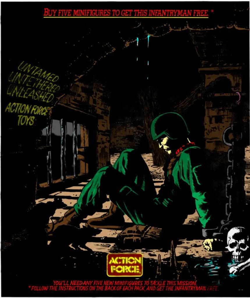
Spock, where the hell's the power you promised?
One damn minute, Admiral
"Red! The colour of my Shadows, The colour of fire and of blood......All that I stand for!" Baron Ironblood, Operation Bloodhound
One damn minute, Admiral
"Red! The colour of my Shadows, The colour of fire and of blood......All that I stand for!" Baron Ironblood, Operation Bloodhound
-
The Kraken Wakes
- SCREEEEEEE!

- Posts: 5275
- Joined: 28 Apr 2007 16:40
- Location: Nottingham
Re: advert for colouring project
Looks great! The AF logo is a bit blurry but thats prob the original - can a better one be put in?
Looks very good and onsiostent next to the other coloured stuff...
Looks very good and onsiostent next to the other coloured stuff...
twitter - @thekrakenwakes / @BIronblood
instagram - THE_KRAKEN_WAKES
instagram - THE_KRAKEN_WAKES
-
Red Laser
- don't eat yellow snow
- Posts: 8083
- Joined: 19 Jun 2007 22:56
- Location: Sittin' on the dock of a bay
Re: advert for colouring project
Thanks the AF logo is a pain to colour especially for a novice like myself I tried to tidy it up.
Spock, where the hell's the power you promised?
One damn minute, Admiral
"Red! The colour of my Shadows, The colour of fire and of blood......All that I stand for!" Baron Ironblood, Operation Bloodhound
One damn minute, Admiral
"Red! The colour of my Shadows, The colour of fire and of blood......All that I stand for!" Baron Ironblood, Operation Bloodhound
-
Chopper
- This is what you get when you mess with the SAS

- Posts: 7221
- Joined: 09 Apr 2003 08:30
- Location: Melbourne
Re: advert for colouring project
Good job, IB. Try a more sandy colour for the skin, it'll look more natural. As far as the logo's go, yank one from the sticker sheets (or the website) and insert it, the res is much better.
-
jamarmiller
- I am Wilder Vaughn, I am the Black Major

- Posts: 3923
- Joined: 07 Mar 2005 15:58
- Location: Fukuoka Japan---TAMPA Florida
- Contact:
Re: advert for colouring project
very very good job man I LOVE IT!!!
way to go!!
just send me a pm and well get you working on a story!
way to go!!
just send me a pm and well get you working on a story!
Re: advert for colouring project
If you're feeling bold, try selecting the layer beneath 'colour', set your brush to 'lighten' and you'll be able to change the colour of the original black line. That may sort the logo probelm.
I did it with the "Next week..." text and dialogue boxes on Sea Fury:
If I was to be really nitpicky, I'd do the floor as grey, to make it feel cold in his dungeon. The flesh is better, but a little too yellow. Try using 'FDAB5F'
Sorry if I sound critical, I'm just keen!
Want blood puddle!!
I did it with the "Next week..." text and dialogue boxes on Sea Fury:
If I was to be really nitpicky, I'd do the floor as grey, to make it feel cold in his dungeon. The flesh is better, but a little too yellow. Try using 'FDAB5F'
Sorry if I sound critical, I'm just keen!
Want blood puddle!!