Q Force Aqua trooper MK2

They fight beneath the waves... in bright yellow bodysuits!
Post Reply
User avatar
scoobydie
Chocks away
Chocks away
Posts: 2258
Joined: 12 Jan 2008 13:17
Location: behind the sofa.........BOOOO!!!!!

Q Force Aqua trooper MK2

Post by scoobydie »

Seems as I have the paints and brushes out, time to expand the :qforce: a little further.
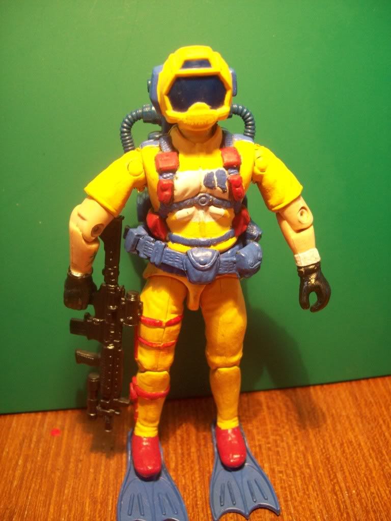
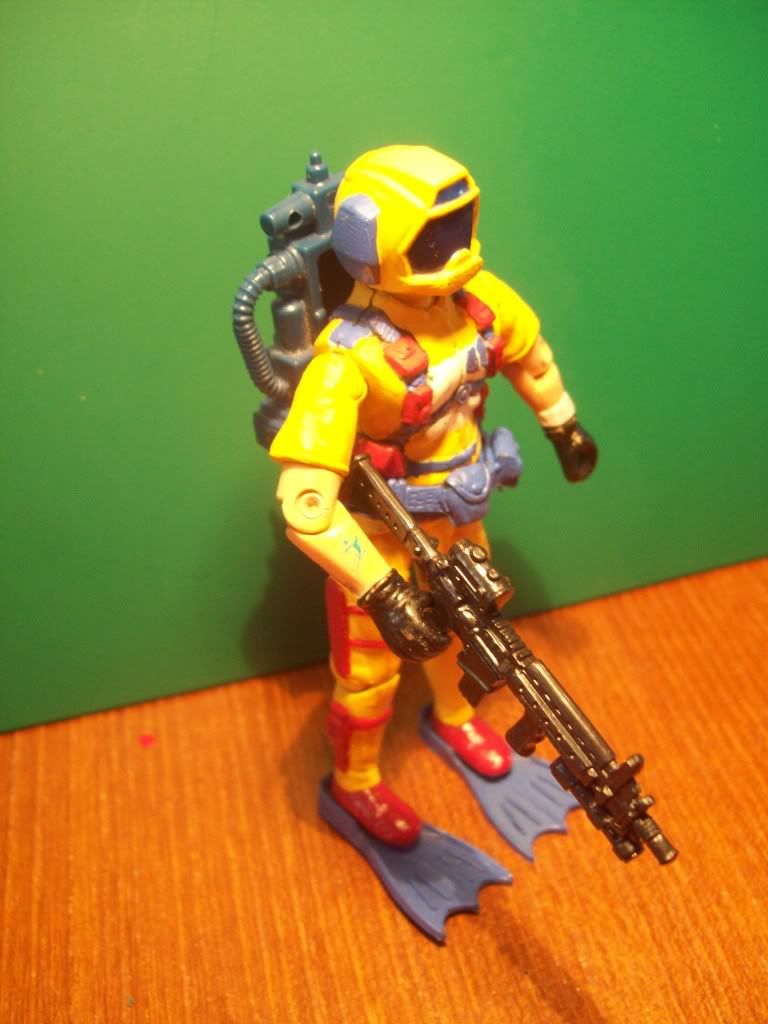
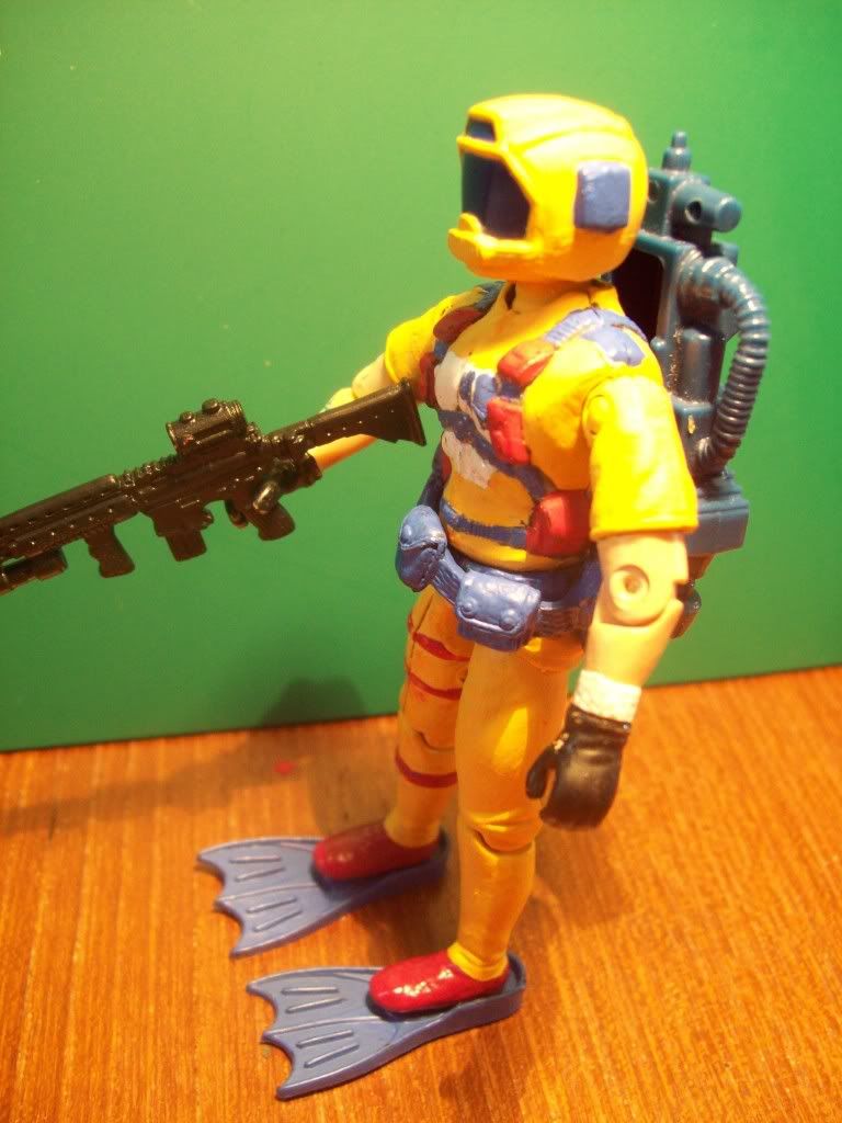
Took a while to find the parts to come together for this, head is a Corps! donation.
Love the "Wet Suit" figure so his body was a natural choice for this guy, legs from the red cobra diver type dude and arms
from Topside ( I think?), has a navy tattoo, could well be.
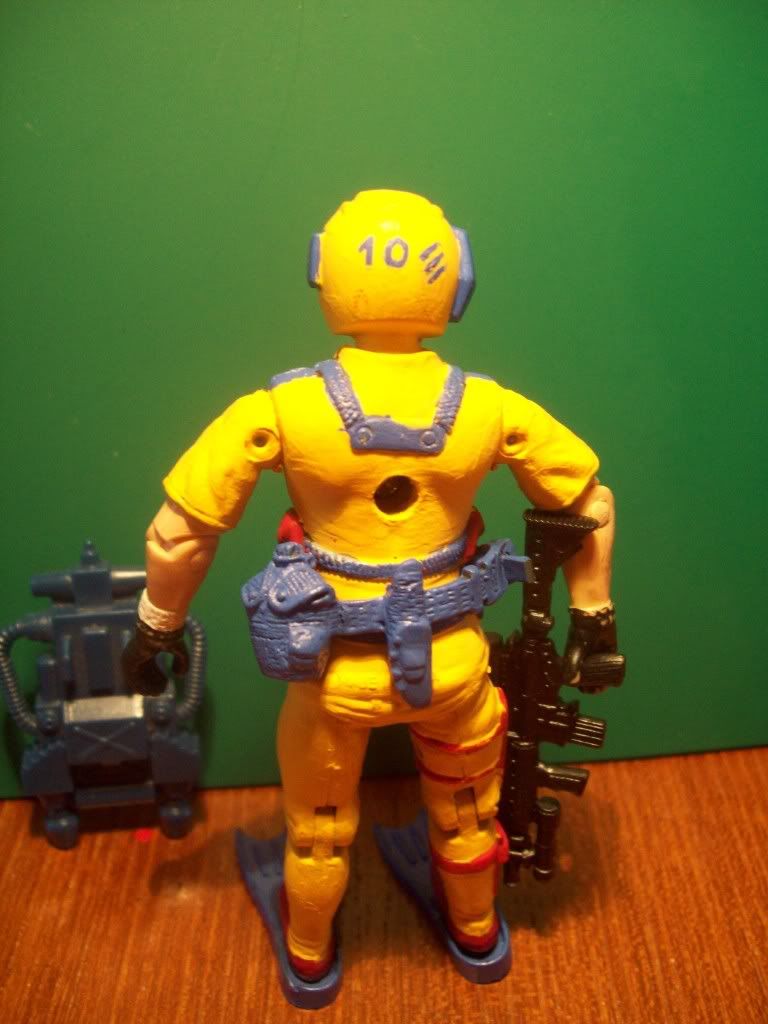
This trooper is "Number 10" as marked on the back of his helmet, just thought it could give him a bit of individuality.
No code name as of yet, just "Aqua Trooper"
Weapon is for use out of water, didn`t want to go too "Eel" style on him

Image

Image

Image

Image
Image
"Are you sure you want to go to red alert sir ?? That would mean changing the lightbulb ! "

User avatar
Sundance
Friendly Dragonfly Inbound
Posts: 5037
Joined: 20 Jan 2009 11:14

Re: Q Force Aqua trooper MK2

Post by Sundance »

Mako? Riptide? Fathom? Manta? Waverider?

like it. apart from the logo...

Malcolm Orr
Red Shadow
Red Shadow
Posts: 951
Joined: 30 Nov 2008 18:27

Re: Q Force Aqua trooper MK2

Post by Malcolm Orr »

That looks really nice. Your yellow paint suffers from the ages old problem of brushmarking due to yellow (and red and white) being tricky to cover the base colour, but a thin layer of wyared down yellow or matt varnish will give it a crisper look.

With regards to the logo, it's better to paint a full oval with no gap and then add the line down the middle. It'll make the gap parallel and also make the corners of the semicircles sharp.

However the overall look of the figure is very good indeed, and nice look at a 'What If?' had the teams AF continued.

User avatar
scoobydie
Chocks away
Chocks away
Posts: 2258
Joined: 12 Jan 2008 13:17
Location: behind the sofa.........BOOOO!!!!!

Re: Q Force Aqua trooper MK2

Post by scoobydie »

[quote="Malcolm Orr"]With regards to the logo, it's better to paint a full oval with no gap and then add the line down the middle. It'll make the gap parallel and also make the corners of the semicircles sharp. quote]

Seems so simple that way!
Why I never think of these things..................
Image
"Are you sure you want to go to red alert sir ?? That would mean changing the lightbulb ! "

Post Reply

Return to “Q Force”