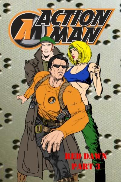
Eye of Agamotto wrote:My vote goes to white. While the red looks smarter, it kinda blends into the background somehow. White is more easily readable (as is yellow). Plus the white is in keeping with volume one.
ya I think white is coming out best, its used also on the old Action Man comics for the writting of subtext on the covers . Its also receiving the most nods at the ACTION MAN HQ too
so right now white is in the lead
Eye of Agamotto wrote: ....................Either way, the art is cool. Knuck doesn't look oafish as he does in the toon, and AM looks tough. As for Natalie, well, she's hawt... for a drawing.

ya we wanted to go with a more slim look of Knuck, its weird sometimes they make him look fat and then sometimes we get this look of him that is super slim


