Page 1 of 3
honest opinions needed......
Posted: 26 May 2009 08:14
by Ross SC
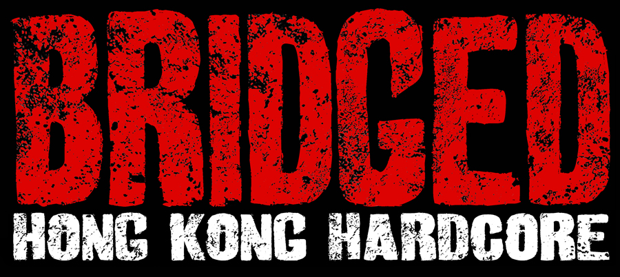
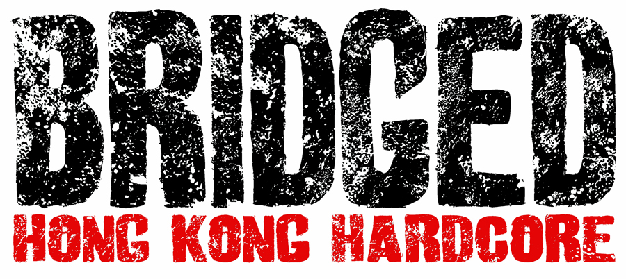
just finished drafting the banner im working on for a local band, just wanted some opinions!
it's very simple, this is a small version, the actual one is 60 inches wide! some of the detail may be lost as it's so reduced.
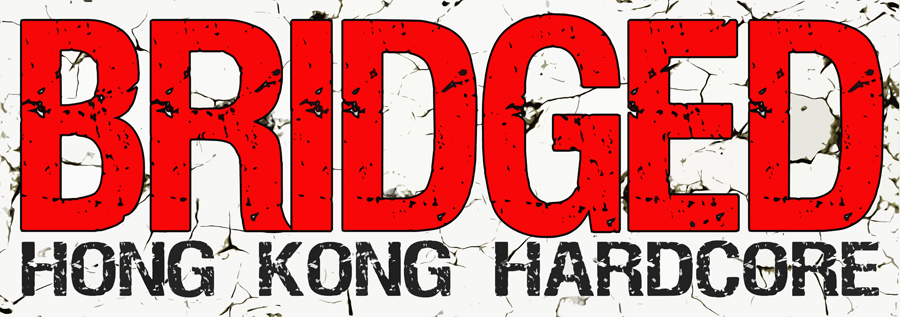
- BRIDGEDDRAFT4small.jpg (287.52 KiB) Viewed 423 times
ive noticed the eroding on the text is a bit too even, so im gonna break it up a bit.
i finished 6 rough drafts of this last night, but they all look pretty much the same, just slight difference in the text eroding.
this is for a stage banner to hang on the wall behind them when they play, so pretty simple. they just wanted really bold text. didnt ask for the cracked background, just wanted plain white but it just looked too dull!
the hard part is the sleeve artwork, what they are talking about is kinda tricky.
i'll post the artwork for my old band later, so you can let me know what you think of that!
any advise/criticism/praise is welcome! lol.
ross
Re: honest opinions needed......
Posted: 26 May 2009 08:27
by Chopper
Looks good, I agree re the eroding is a too even, doesn't look natural. But looks good I think.
Re: honest opinions needed......
Posted: 26 May 2009 08:37
by Double-Tap
looks good to me.
if you were going to change it the only thing i can think of is to reverse the black and white, black background with white cracks and white hk hardcore, but thats only if you feel the need to change anything.
Bill
Re: honest opinions needed......
Posted: 26 May 2009 09:44
by gung-hoeddie
it looks pretty good to me, although i haven't got an artistic bone in my body.
Re: honest opinions needed......
Posted: 26 May 2009 09:51
by Lady Jaye
Not a very surprising design, but OK. If you are going to use erosion, get it printed on study material. Creasing material (eg. cloth) will make the erosion look rather silly.
Re: honest opinions needed......
Posted: 26 May 2009 09:53
by The Baron
I like it, but as Double-Tap says for a stage backdrop it may be more striking on a black background, especially when the lights go out. Can you do a quick colour invert as a test?
Re: honest opinions needed......
Posted: 26 May 2009 10:26
by Ross SC
Double-tap wrote:looks good to me.
if you were going to change it the only thing i can think of is to reverse the black and white, black background with white cracks and white hk hardcore, but thats only if you feel the need to change anything.
Bill
totally agree, the white background really annoys me, with a black background it could just be left plain & look ok, + the text wouldnt need an outline but these guys are adamant they want a white background!
one thing i hate about all this "hardcore" (i cringe calling it that!) is it's all so damn generic, music + artwork!
Lady Jaye wrote:Not a very surprising design, but OK. If you are going to use erosion, get it printed on study material. Creasing material (eg. cloth) will make the erosion look rather silly.
yep, would look much better, but for them i think would be "too much" im trying not too make it too good! i wish i had a bit more free range with this, but it's a case of "heres a bunch of bands we like, we want it to look like them"!
The Baron wrote:I like it, but as Double-Tap says for a stage backdrop it may be more striking on a black background, especially when the lights go out. Can you do a quick colour invert as a test?
f*cking STUPID WHITE BACKGROUND! it's killing me.
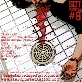
this is the artwork for one of my old bands:
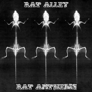
- RATCOVXRAY.jpg (59.96 KiB) Viewed 377 times
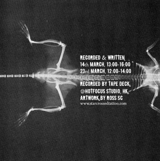
- raend.jpg (93.56 KiB) Viewed 377 times
band i started with same guitarist but quit due to lyrical content:
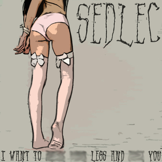
- breakyourlegs2clean.jpg (88.04 KiB) Viewed 378 times
- sedback10.jpg (188.83 KiB) Viewed 375 times
one man black metal project i helped with artwork/releasing stuff:
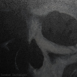
- saedusskull.jpg (88.73 KiB) Viewed 376 times
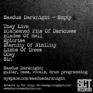
- saedusback.jpg (106.63 KiB) Viewed 375 times
Re: honest opinions needed......
Posted: 26 May 2009 19:37
by Thundershot
I agree,
the white's shite as a background ..but you've gotta do what the clients ask for I suppose, how about ditressing the edge's of the type face a bit or having a big crooked craked line running at a diagonal though the red lettering?
Does the lettering have to be a solid colour? or could you do a sort of pitted or rusted car body effect?
Hope none of this sounds stupid..
T'Shot
Re: honest opinions needed......
Posted: 26 May 2009 20:54
by Ross SC
ok, hows about these?
- bridgenew1small.jpg (477.79 KiB) Viewed 341 times

- bridgenew2small.jpg (377.36 KiB) Viewed 341 times

- bridgenew3small.jpg (532.07 KiB) Viewed 340 times
- bridgenew4small.jpg (384.11 KiB) Viewed 338 times
Thundershot wrote:I agree,
the white's shite as a background ..but you've gotta do what the clients ask for I suppose, how about ditressing the edge's of the type face a bit or having a big crooked craked line running at a diagonal though the red lettering?
Does the lettering have to be a solid colour? or could you do a sort of pitted or rusted car body effect?
Hope none of this sounds stupid..
T'Shot
nope, doesnt sound stupid!
Re: honest opinions needed......
Posted: 26 May 2009 20:57
by The Baron
I'd say the first for the sleeve, although the second may be more sensible for a backdrop.