Page 2 of 2
Re: ACTION MAN : ACTION FORCE: RED DAWN
Posted: 01 Aug 2008 07:29
by jamarmiller
Okay so playing around here with things
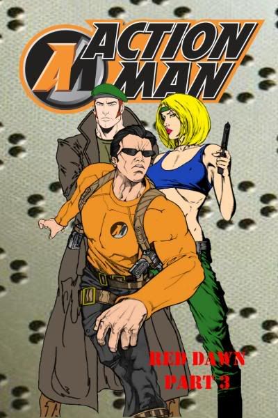
Here is the Altenate Cover to Action Force Red Dawn Issue #3 its retitled and has a new cover The new title is ACTION MAN : RED DAWN Part 3
which one do you guys think look better the red ,yellow,white. or orange writting
I wanted RED but I think White sticks out more
what say you!


Re: ACTION MAN : ACTION FORCE: RED DAWN
Posted: 01 Aug 2008 09:04
by Space Commander
Yeah, keep the
RED theme going! Cool. Good job so far, Jamar!
PS. How does she manage to stand upright...?

SPACE COMMANDER
Re: ACTION MAN : ACTION FORCE: RED DAWN
Posted: 01 Aug 2008 10:29
by jamarmiller
Space Commander wrote:Yeah, keep the
RED theme going! Cool. Good job so far, Jamar!
PS. How does she manage to stand upright...?
SPACE COMMANDER
LOL good question
okay so one vote for the
RED
Re: ACTION MAN : ACTION FORCE: RED DAWN
Posted: 01 Aug 2008 20:08
by Eye of Agamotto
My vote goes to white. While the red looks smarter, it kinda blends into the background somehow. White is more easily readable (as is yellow). Plus the white is in keeping with volume one.
Either way, the art is cool. Knuck doesn't look oafish as he does in the toon, and AM looks tough. As for Natalie, well, she's hawt... for a drawing.

Re: ACTION MAN : ACTION FORCE: RED DAWN
Posted: 01 Aug 2008 23:14
by jamarmiller
Eye of Agamotto wrote:My vote goes to white. While the red looks smarter, it kinda blends into the background somehow. White is more easily readable (as is yellow). Plus the white is in keeping with volume one.
ya I think white is coming out best, its used also on the old Action Man comics for the writting of subtext on the covers . Its also receiving the most nods at the ACTION MAN HQ too
so right now white is in the lead
Eye of Agamotto wrote: ....................Either way, the art is cool. Knuck doesn't look oafish as he does in the toon, and AM looks tough. As for Natalie, well, she's hawt... for a drawing.
ya we wanted to go with a more slim look of Knuck, its weird sometimes they make him look fat and then sometimes we get this look of him that is super slim
Re: ACTION MAN : ACTION FORCE: RED DAWN
Posted: 04 Aug 2008 20:04
by fuzzchile
Yellow seems easiest to read ..well on this computer screen best way to see I find isto print all four of them(the orange one don't really work that well though )see which one leaps off the page the most:)
Re: ACTION MAN : ACTION FORCE: RED DAWN
Posted: 30 Nov 2008 03:32
by jamarmiller

KNUCK --- this image has been ripped from a page that will appear in a future issue of RED DAWN
enjoy Knuck Fans!
and for your Natalie Poole Fans
