Yeah I know what you mean. On that last page it wasn't until Sunday that I noticed Jackal had a hole in his sleeve, and I finished that one months ago! I also never noticed the monkey's left arm on the previous page - I coloured it as tree the first time.
Hey, next week's episode contains an Easter Egg. First one to spot it wins a Balck Major figure!
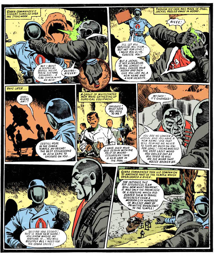
Nah, I'm kidding. The original art was full of black shading, so it was obviously intended as a dark colour. I'm going with The Baron having already started to alter his physical appearance as part of his transition.
Chapter 4 is now up! Find that Easter Egg! Win a Black Major! *
Well I use the originals for reference as closely as I can. I have a pretty detailed knowledge of the back catalogue, and I know which strips were B&W, which had coloured pages and which had colour covers. So for example, if I need a skintone for an arab, I know to go to Operation Stubborn, if I need a Jungle Sky I know to go to Jungle of Doom, etc. I took the United Nations interior from the opening story in Deep Cover.
If I'm uncertain of something I'll do my best to imitate the original style (such as the explosions and dust clouds). I know very little about light sources and shading, so I mostly go for basic blocks of colour, my few forays into skintones made everyone look sunburnt LOL.
I suppose I also have good knowledge of the figure colour schemes too, such as which bits on a Red Shadow are white trim etc, although I admit I did check the yojoe archive for Cobra Commander and Destro.
But I guess it's down to using the original Battle pages as a colour palette as opposed to the in-house Photoshop colours. Of course that was hampered by the fact that, midway through the process, I decided to clean up the colour covers, which changed everything. In the end I had to dig out the old duller covers so my work was consistent. I'm actually thinking of changing back to the old covers and datafiles, I know the new versions are brighter but I've noticed several examples where the colours have altered a bit, for example the homepage, where the Baron's skin has turned a bit yellow.
I still say J-Man does the best authentic style, I notice he uses the original beige of the paper for his word balloons, and I swear he deliberately adds a grain to the page as well, but thank you for the compliment! I'm very happy with the way they came out.